2019-2020
Wegmans Weather App
Me and one other RIT design student were tasked with replacing the existing email based notification platform with a better digital solution.
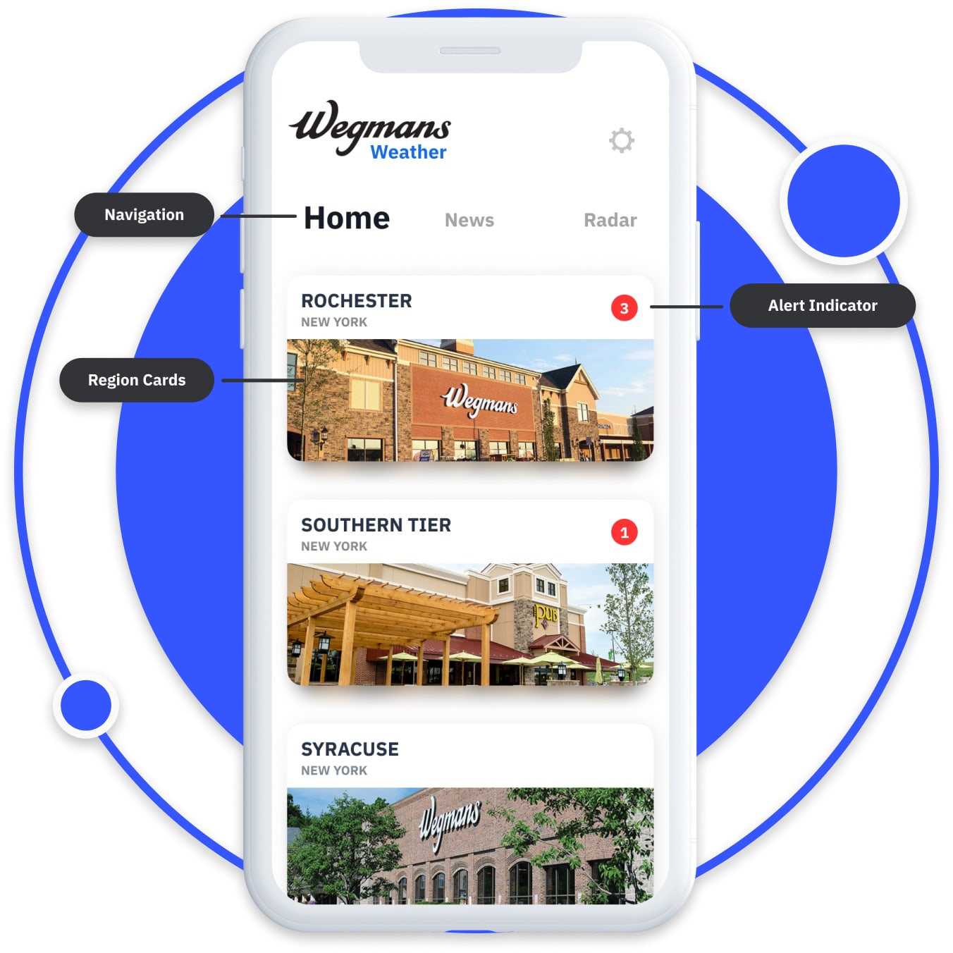
In the grocery industry, knowing the weather ahead of time to determine what to stock or what percautions to take to keep customers and staff safe is very important.
The method of weather information distribution at the time for Wegmans was through mass emails containing the forcast and preparation instructions for each district. It is cited as being slow, tedius and even inaccurate at times.
A digital means of communication is needed to provide realtime forcast reporting and user centric data to improve the efficiency and effectiveness of weather reporting.

At the very least we needed the ability to view regional weather reports. Outside of that, being able to include the ability to recieve live notifications, add custom regions to a dashboard and have a radar to see current weather attributes would be beneficial.
Once all that is achieved, the next step would be to focus on enhanching the user experience through customizations and interactive features such as weather animations, news section for less important information, and region re-ordering.

We wanted the users to feel as if they could quickly go between regions and forecasts as to not feel bogged down by all of the information available. But also lets them multitask and plan between the other stores.
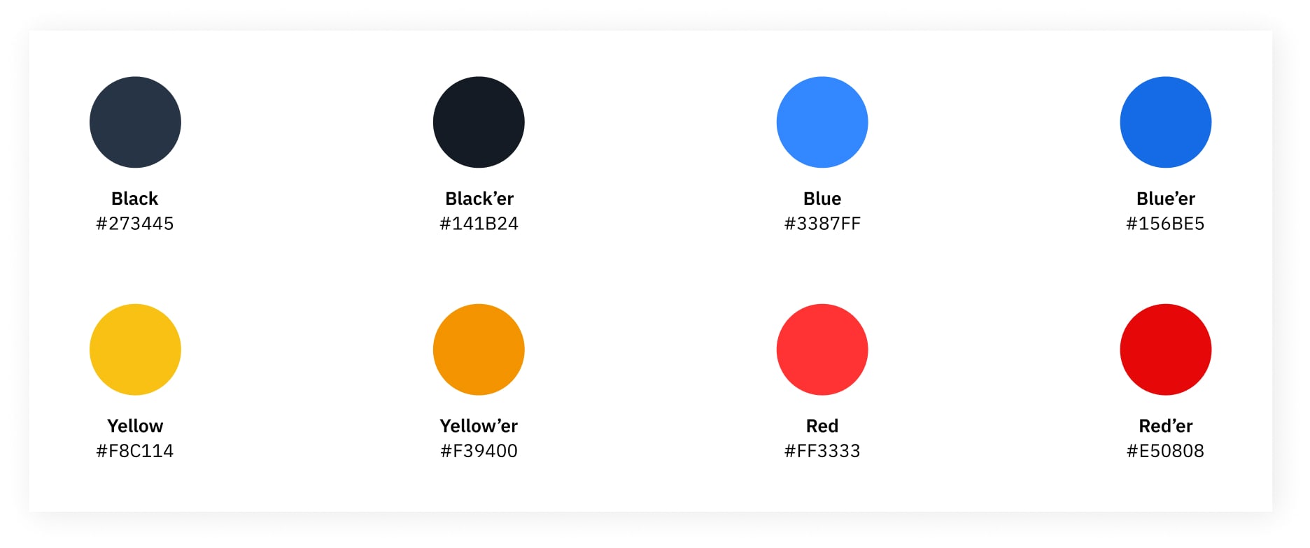
The majority of the type and UI is colorless. Any color is used are to indicate severity of the weather event or the zone that the event is in. The rest of the color finds its way in through animations and store front photography for the region cards.
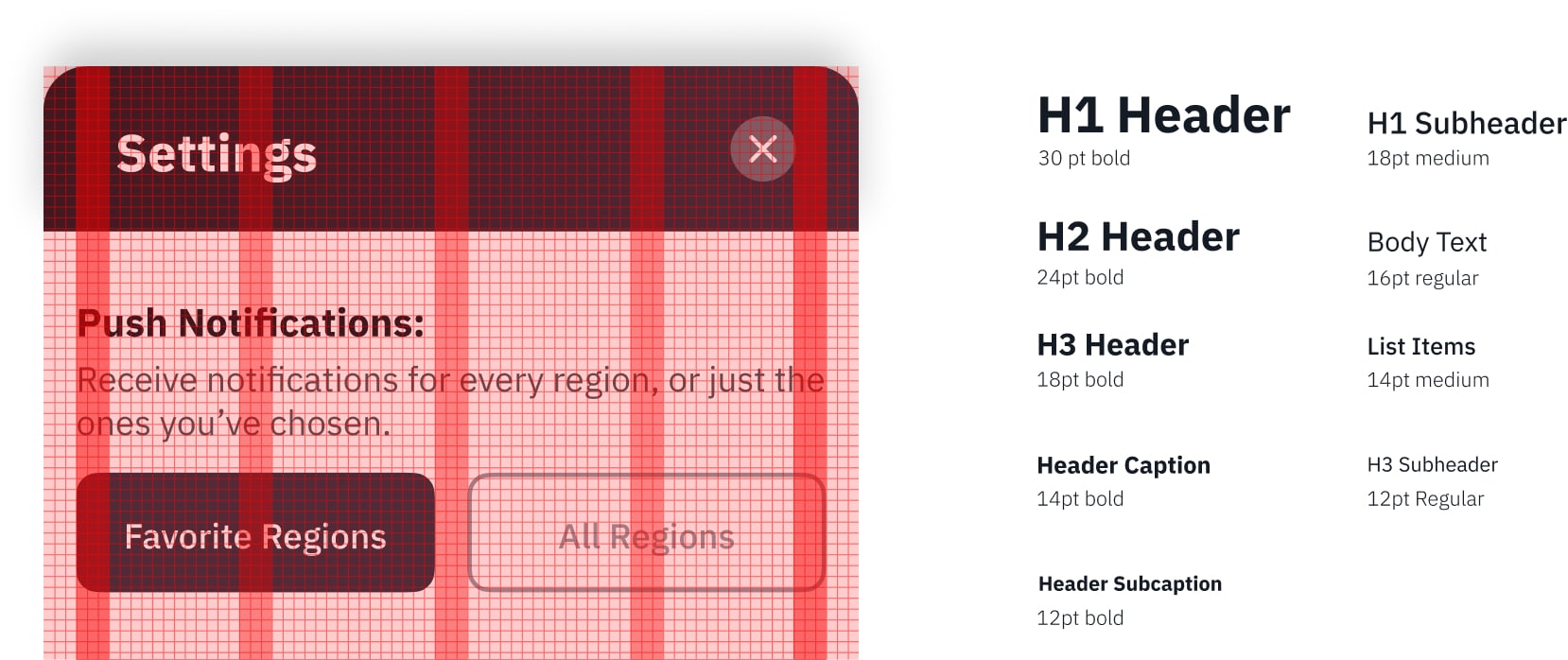
We wanted the users to feel as if they could quickly go between regions and forecasts as to not feel bogged down by all of the information available. But also lets them multitask and plan between the other stores.
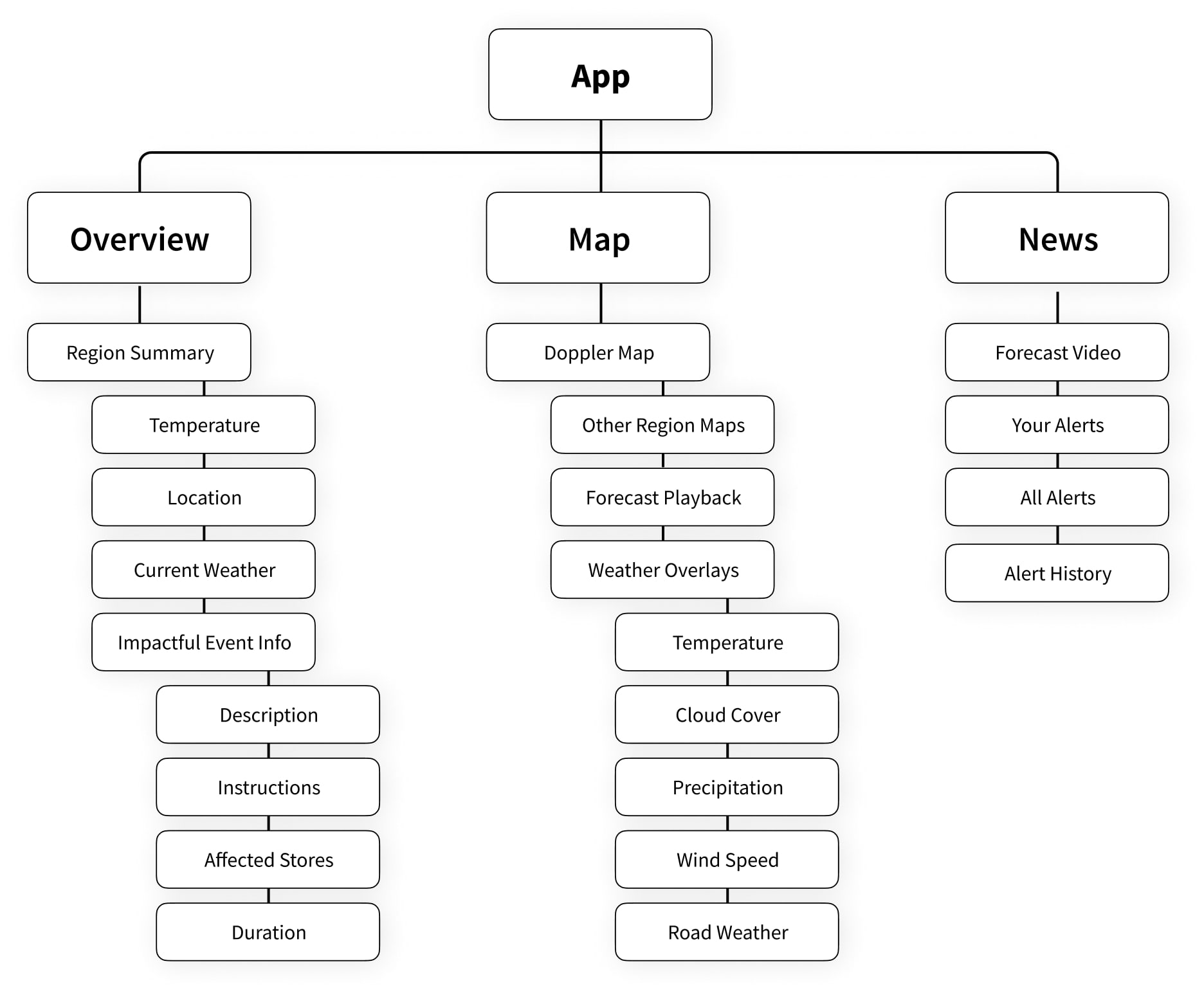
When creating the user interface we worked in Figma which lets us collaboratively work on our designs in real time. This helped us work synchronously and iterate quicker then other options. Any complex or raster designs would be created in their respective applications. This let us have a history of past designs to reference and a shared style library.
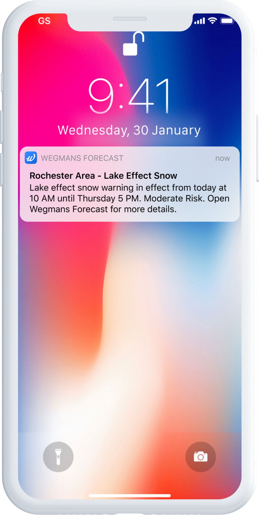
Realtime Notifications
Users will have the option to turn on individual alerts per store region to prevent too many notifications from bothering them. But these alerts provide the most important information to determine weather the user needs to act upon it.
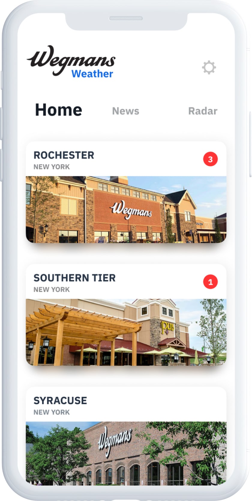
Dashboard
The dashboard has region cards that feature the store front and the amount of weather alerts in each region.
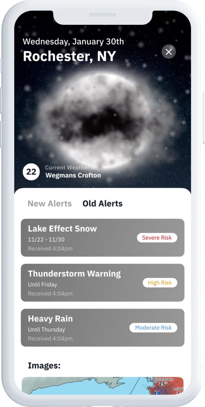
Region Dashboard
Selecting a region bring up the regions dashboard providing an overview for that region including alerts ranked by severity and weather at a particular store.
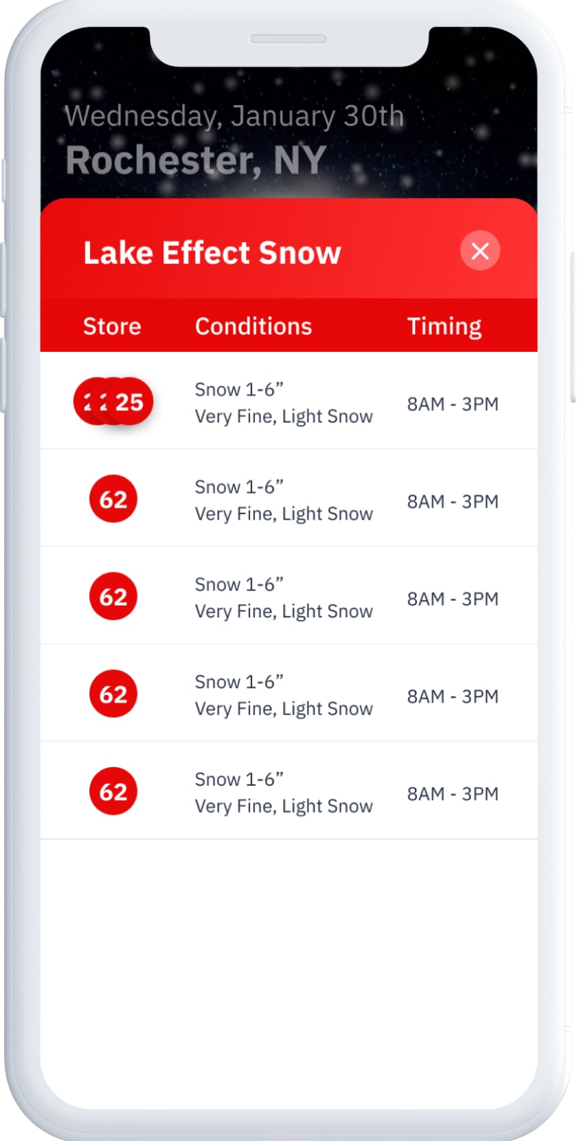
Individual Weather Events
Each weather event gets its own card that includes store breakdowns. Allowing for district managers to vew entire regions and store managers to view their specific store.
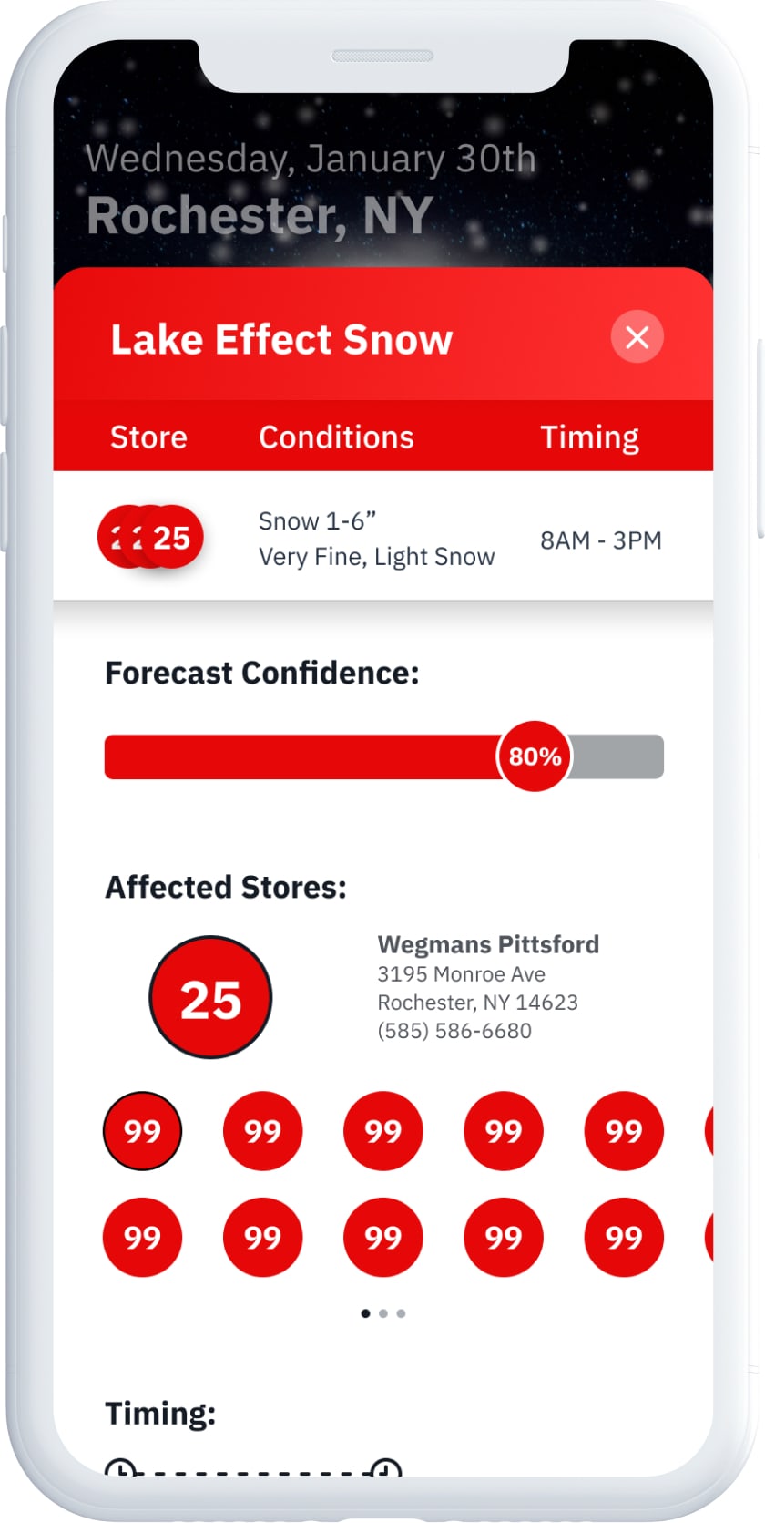
Confidence Level
The in-house meteorologist asked to have us include a confidence level that she can adjust according to her faith in her prediction. They felt it gave a good overall indicator and things below a certain level would not be acted upon.
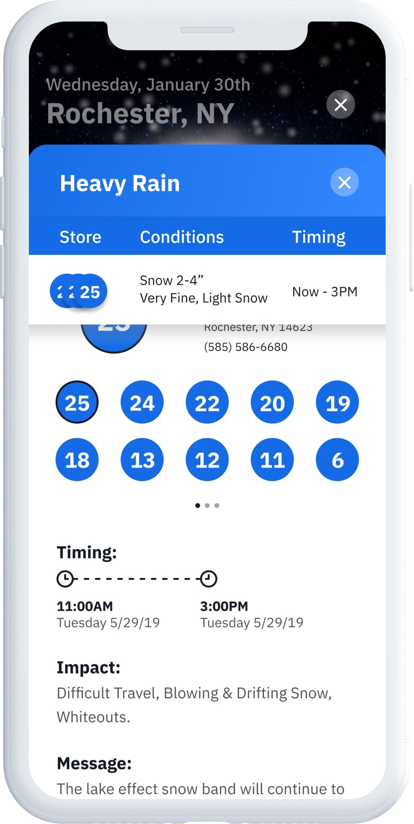
Weather Event Information
Each store group has information including the impact of the weather, what preparation to take, and the predicted length of the event.
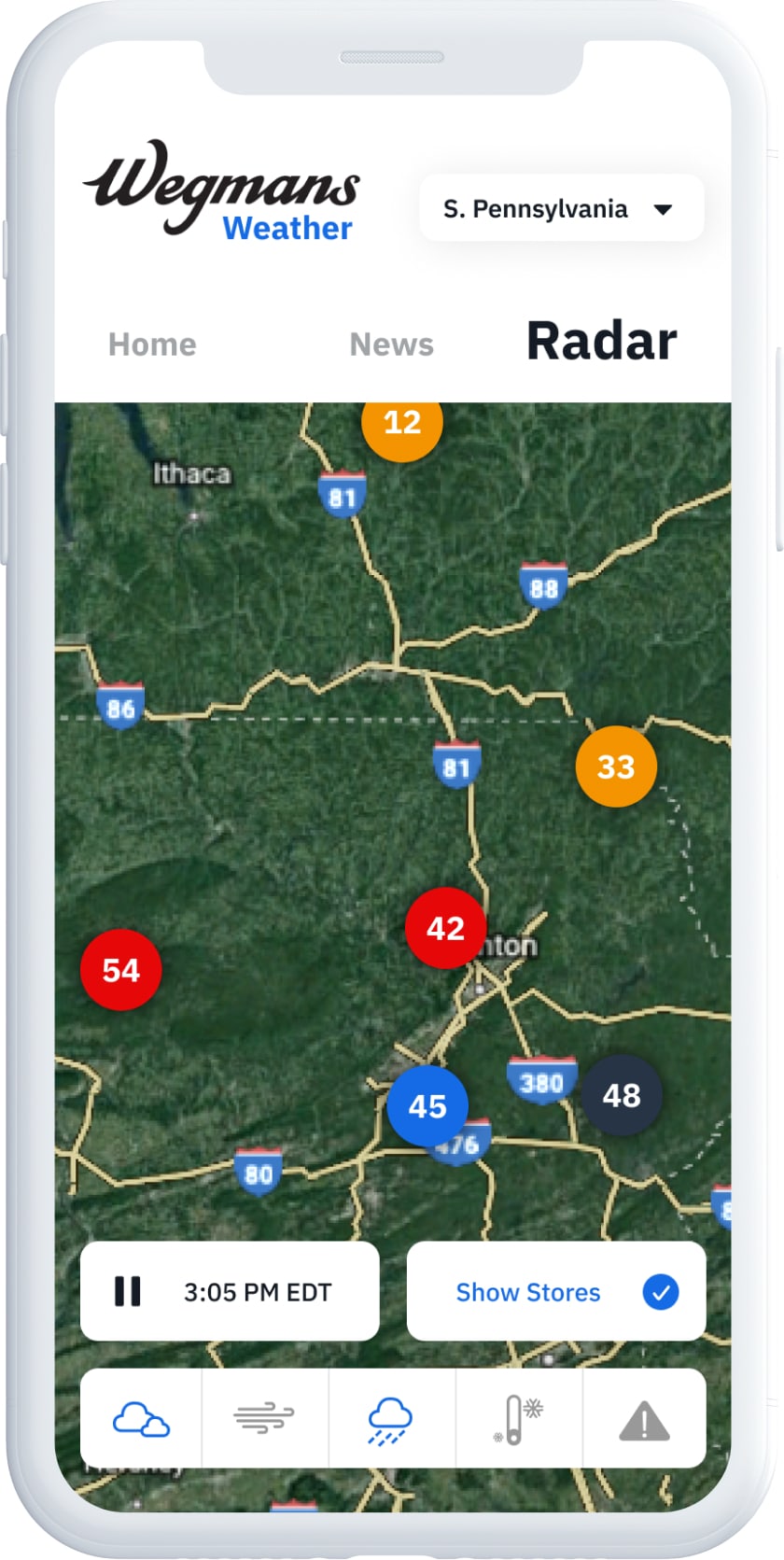
Radar
The radar page has each store mapped out with a dot over it indicating the highest severity alert affecting that store. It also has region selectors to speed up store finding and weather overlays.
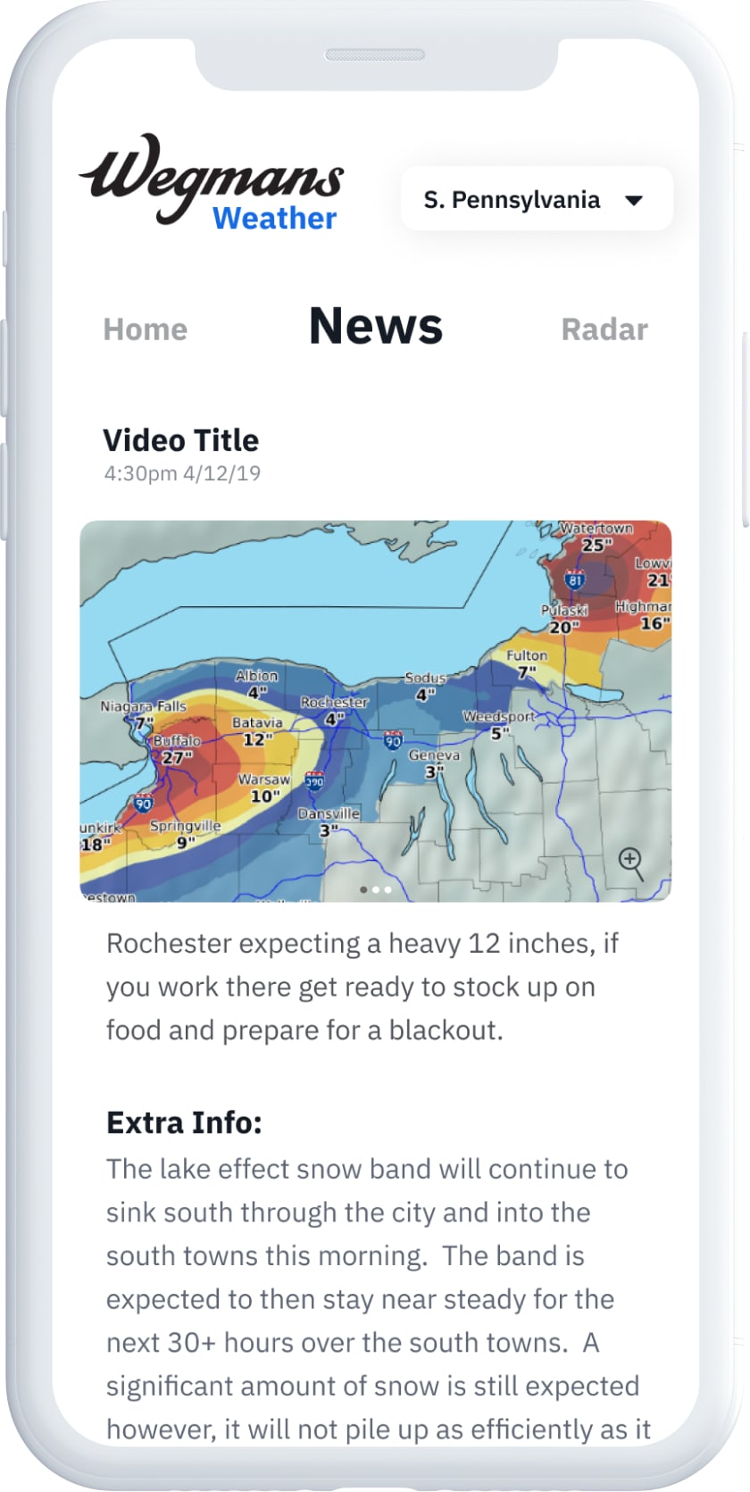
News
The meteorologist also wanted a news section to be able to tell the users fun facts or information about the weather that does not have a major role in the weather communication. But can be interesting and fun to read and learn about.

ABC's of Symbiosis

3D Design
Coin Care