2021-Present
Paychex
At Paychex, I have been working on the next generation of large scale product design systems and feature integration alongside my work on AI systems and future business strategy.
Unfortunately I cannot show too much of my work as it is confidential. I'll show what I can but reach out if you want more details.
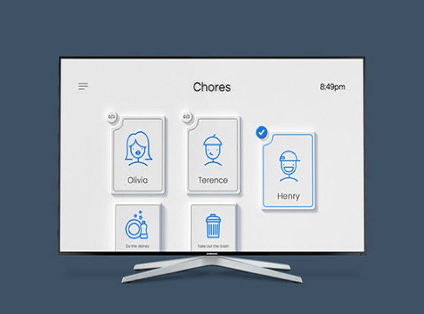
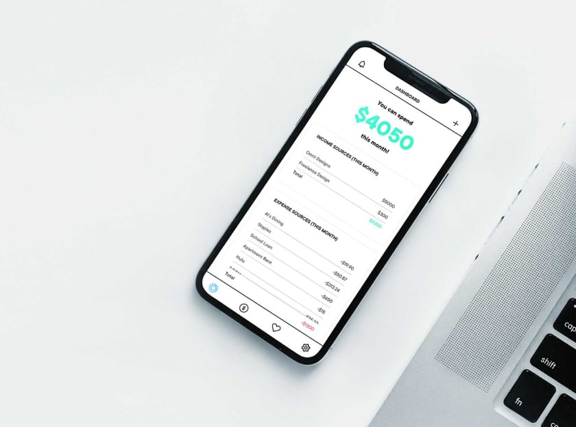
Over the course of my time at Paychex, I’ve been lucky enough to touch many different responsibilities within the company. When I first started I focused on working within various lines of business to improve and incorporate features within the application.
After doing that for about a year one of my teams and I proposed a radically new solution to design system architecture and management to support the companies immense requirements.
All along the way I have also been working on a smaller team that is primarily focused on future visioning and product strategy to pave the way for Paychex to transition to new technologies.
The team and I realized the growing need for a new design system to support the company and its growing investments. The system that was already in place was getting antiquated and we were at a crossroads of a total redo or continue patching it. We chose a total redo based on a methodology that would prevent the need for any sort of rework in the future.
This system we call, the agnostic design system, and it is based off of core web standards to prevent this sort of technological bottle necking that stale/unsupported frameworks can induce. We had 3 core values we wanted to imbue into this system.
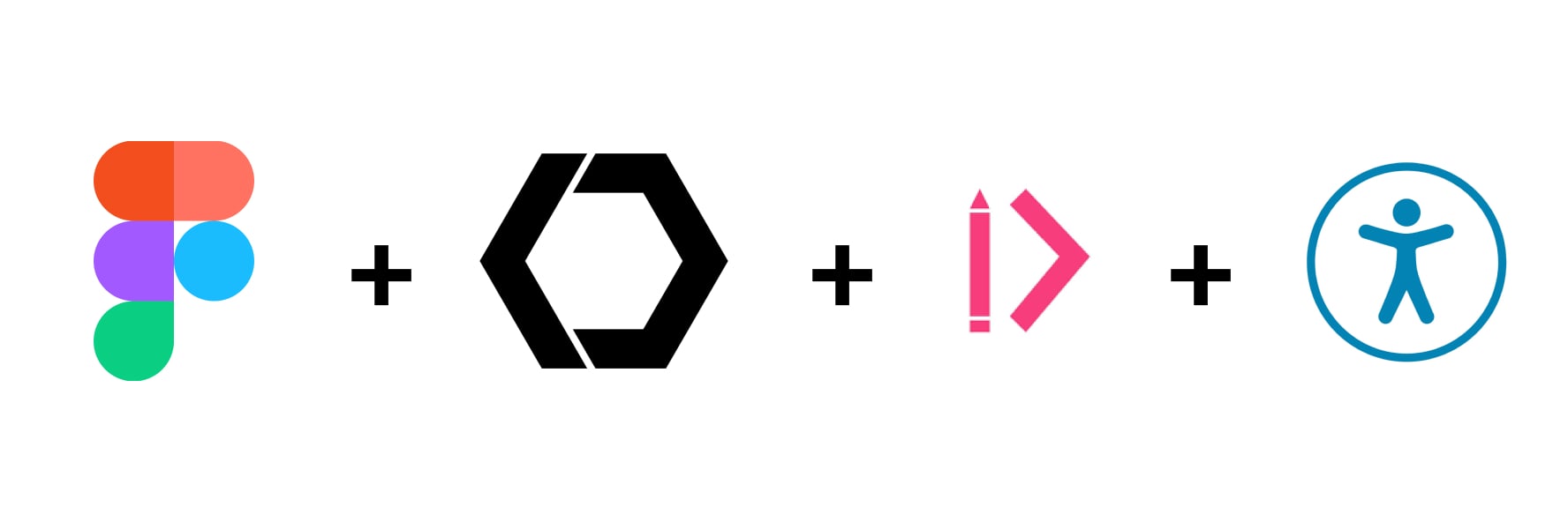
It had to be Agnostic, Flexible, and Accessible.
An agnostic system means that it is not pinned to any one resource or in this case, framework. Building on top of web components means that this system is decoupled from the restrictions of other systems. With the agnostic system as the foundation, multiple applications can be spun up on top of it using any technology they prefer.
Check out part of a larger presentation I gave on the design system focused on tokens.
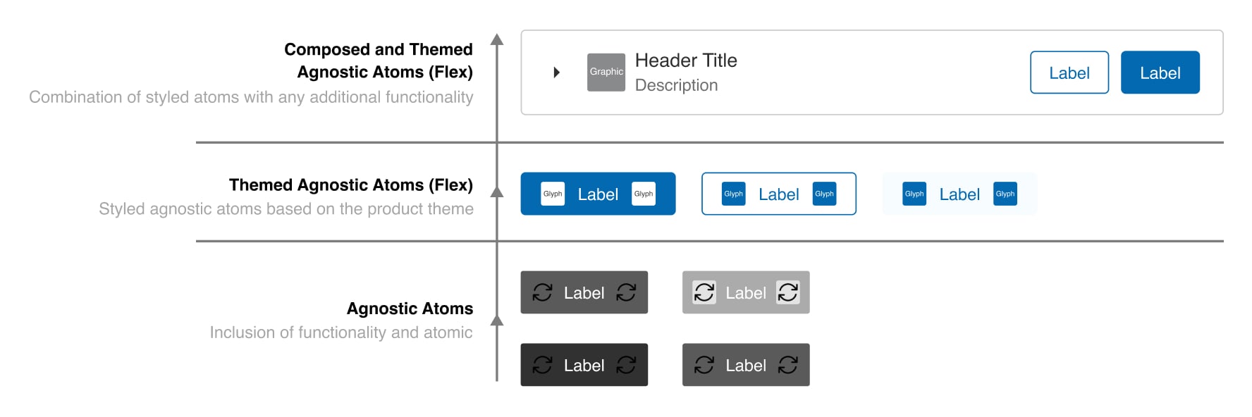
Flexibility comes with the agnostic nature of the system but is improved upon with the additional of features to allow for products using it to achieve their goals much quicker. This is where the concept of tokens and slotting come into play. Slotting provides locations within UI to allow for further customization and style application through the insertion of assets like icons and glyphs. This is even extended to allow for other components to be included, resembling an atomic component structure. Tokens, on the other hand, may sound like a very obvious thing for a design system. But we took this a step further by developing out a dynamic token infrastructure that allows for theming, white-labeling, accessibility adherence, and a greatly improved designer/developer relationship.
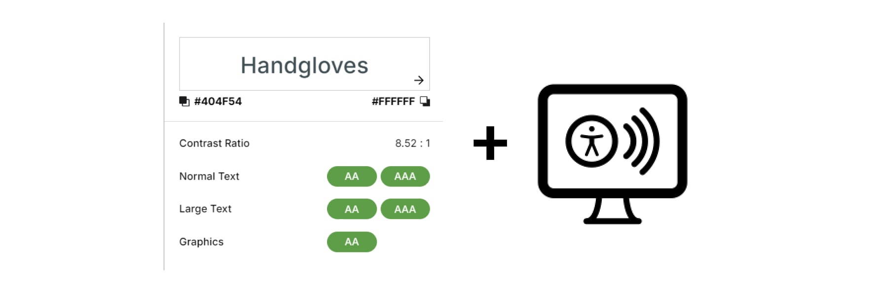
We included accessibility as one of our core tenants because we believe everyone should be able to enjoy any application. It’s very difficult to provide a system that incorporates 100% accessibility compliance, which is part of why many companies ignore accessibility all together. But we opted for providing both a baseline of accessibility incorporation within each component and the ability to achieve full WCAG compliance during the implementation phase.
I go much deeper into these concepts in my book, “Universal Design Systems” , give it a read!
The creation of such a powerful system required much trial and error. Not just to get the parts of the system to function correctly, but to properly document and educate the future users of such a system.
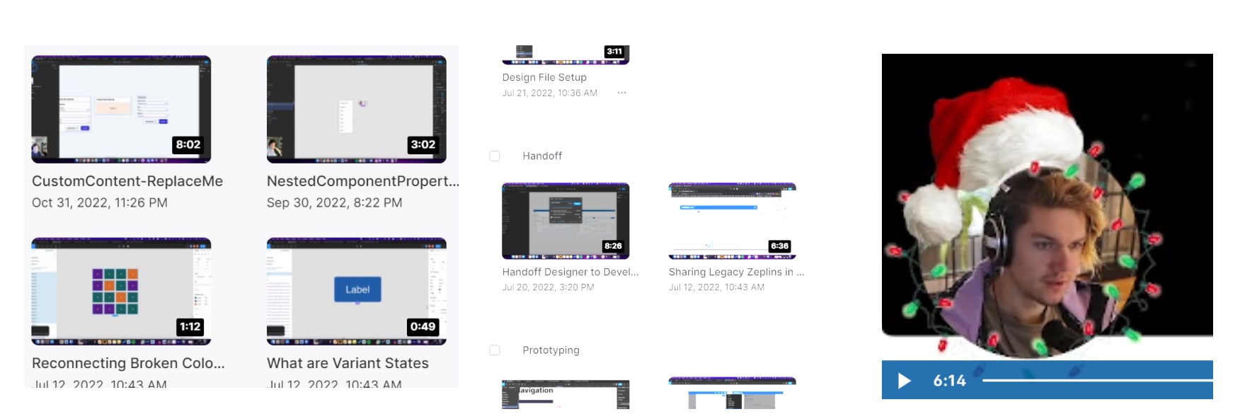
Along with my work on the system directly, I also ran regular DSX update sessions for the organization, instructional videos, documentation, and so much more in order to properly support the system and its stakeholders. The process for all this spread across many mediums and really tested my ability to adapt to the changing environments. Let me provide a glimpse into some of these efforts.
Here is one of the lessons in the series I gave on visual design.
Lucky for me, my extra-curricular passion for development paid big dividends for this work. Being able to understand the components structures, various frameworks, and many complex concepts within the web development universe allowed me to properly communicate between teams and create systems within the design team that reflected the coded system we were creating.
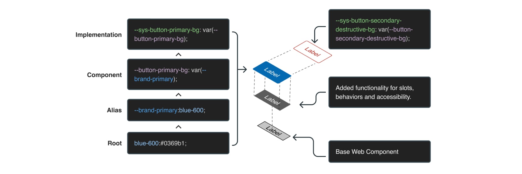
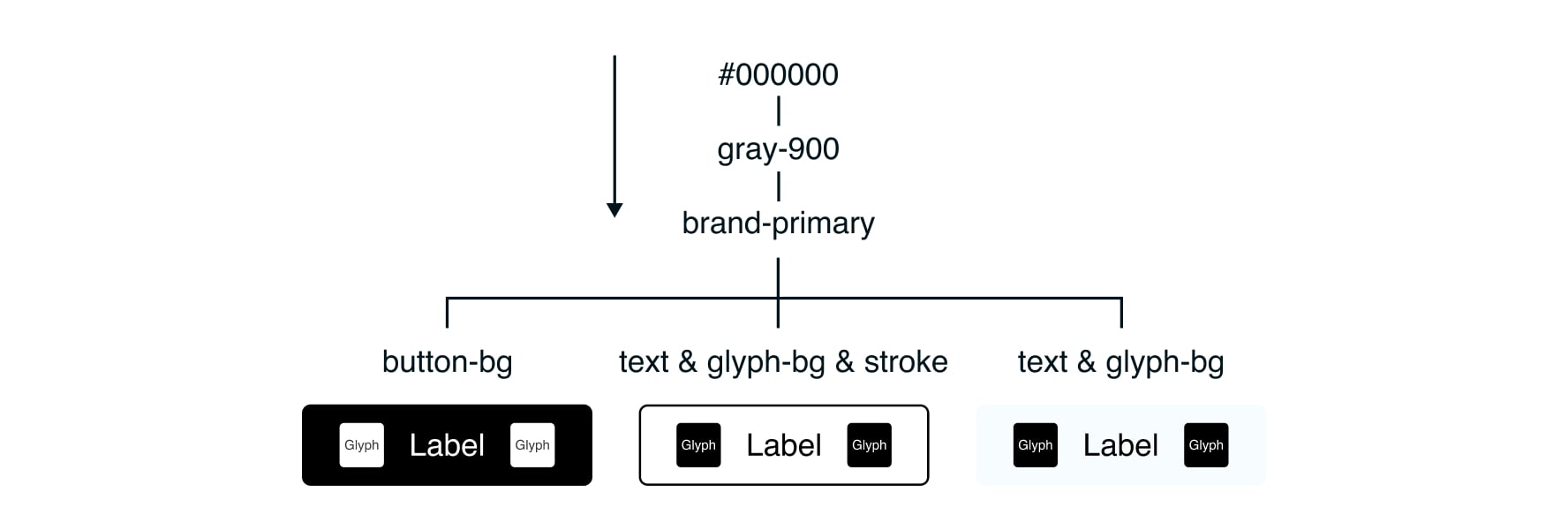
A great example of this is the token system I created. This system first started similar to how most use tokens today, utilizing semantic naming and alias token structures. But after running tests with some components and designers in the field, I quickly realized the main issue with them.
These tokens were too flat, they live on this obscure plane of existence that felt arbitrary and did not play well with our other systems. Much time was spent on pen, paper, and excel. I needed to map out the logic of these tokens and figure out how they could be more versatile.
In the end I had three core token layers that we would work with. Root and alias, of course, but the addition of a third layer. The component token layer. The purpose of the root tokens is to provide that base kit of styles that the product has assigned to its identity. It consists of a variety of color, space, and type scales.
The alias layer is the area that theming capabilities are incorporated.
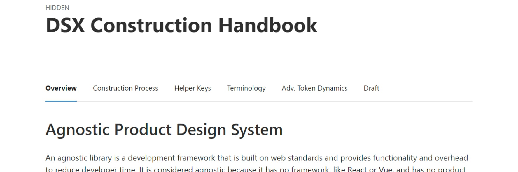
Throughout my work on the system there were many new methods of construction that I created that needed to be documented and explained to my fellow DSX team (Design Systems Experience). To accomplish this I created the Component Construction Handbook. This book outlines the entire process to produce components from our agnostic UI kit, how to apply the proper layering structure, and how to use concepts like slotting and tokens. Much of this work included adding designer experience enhancing features. To make their jobs easier I incorporated a few features with Figma such as color inheritance within component assets, documentation cards per component, and a properties panel that clearly shows their ability to customize components.
This internal book serves to keep the work on the DSX team consistent, provide greater transparency for our fellow developers, and act as a guide for future products picking up our agnostic framework.